Intro
Kataleya - Restaurant Pizza Coffee Wordpress Theme
- Features: WordPress, HTML5, CSS3, Restaurant, Pizza, Coffee
- Type: WordPress Theme
- Created: 27/07/2014
- By: AnpsThemes
- Version: 1.0.0
- Email: support@anpsthemes.com
Hello! First of all we would like to thank you for purchasing our template! :) If you have any questions that are beyond the scope of this help file, please feel free to send your question on support@anpsthemes.com.
This file will teach you how to set up and use our theme.
This file is really extensive so you might think the theme is hard to use, actually its not, you probably just might jump in the code and explore everything yourself, this file is more of a reference work if you do not know what to do.
Have fun using our template!
Best regards,
AnpsThemes
Installation
You can either choose to upload the theme to your server via FTP (only upload the unzipped theme folder into the folder wp-content/themes/) or via WordPress upload function. To use the upload function of the WordPress admin panel make sure to ONLY upload the main theme folder and not the whole archive file that you received from ThemeForest.
If you are new to WordPress and have problems with setting up the theme you might want to import the dummy content file that comes with the theme. You can import this file by clicking the "Insert dummy content" Button in the Appearance → Theme Options → Dummy Content. The theme will then import dummy posts and pages from the live preview (please note that you will not receive the images that we used on our demo site, as we are not the owners of them).
Beginner Resources
Theme Options
To visit the main theme options, either click on Theme Options in the admin bar (bellow the address bar) or go to Appearance → Theme Options.
Style Settings
Our template is design with customisation in mind! That means you can create a very unique website, with just setting our theme options.
Theme Style
You can change colors separately, but you can also choose one of our predefined color schemes, to either just use as your theme scheme or as a basis from which you can set colors as you wish.
Font family
Here you can choose three font types:
- Font type 1: used for headings (we used Titillium on our demo site, which is a font that is included inside the fonts folder)
- Font type 2: used as the main body font (we used Arial on our demo site, which is a system font)
When selecting a font family you will be able to choose a font from three groups:
- System Fonts: here you can find all of the basic fonts, from Times New Roman to Comic Sans.
- Custom Fonts: under here you will find all of the fonts you upload to the theme. See Upload Custom Fonts section for more details.
- Google Fonts: Our theme supports 600+ google fonts, so you have the freedom to choose whatever font you would like, but be aware that our theme uses certain font weights that may not work good with certain font families. Note that Google keeps adding new fonts, so see Update Google Fonts section for more information.
Predefined color Scheme
Here you can choose from predefined colors schemes. When you choose a color scheme, it will only fill in the options below, so you can still change any color, without editing the predefined colors.
Setting the colors
You can put in the HEX values for what color you would like, or you can click on the colored box, which will open our colorpicker.
Update Google Fonts
At the initial theme installation no fonts will be added so you will need to import them by pressing Update Google Fonts in this section. Note that the process might take a while, as there are quite a lot of font families that need to be imported.
If in the future you will see a new Google Font and would like to use it on your site, then import the fonts again by pressing Update Google fonts.
Upload Custom Fonts
This section allows you to add new font families. The fonts can be easily added by selecting a .zip file (you need to provide more than just one font file type, so that all browser will be able to use you font) and pressing Save all changes.
General Settings
Page layout
Here you will find all of the theme layout settings, such as is the theme boxed, is responsive activated, etc.
Disable Responsive
Here you can turn off responsive mode for template. If the responsive option is turned off, then our the won't adjust to all devices (mobile, tablets etc.).
Disable page title, breadcrumbs and background
This options will hide the bar that is just below the menu, where the page title and breadcrumb is displayed.
Disable breadcrumbs
Check this option if you want to display the bar that is just below the menu, but only hide the breadcrumbs.
Boxed
The default value for the page layout is Full layout, but you can also select the boxed version. Once you will select the boxed version you will be able to choose 9 patterns or a custom background, which you can set to either a stretched or tilled image (tilled is best used for adding your own patterns) or you can pick a solid color.
Hide slder on mobile
If you check this option than slider won't show on mobile devices.
Page Setup
Coming Soon Page
When this page is selected, all the users visiting to your site will be shown this page.
404 Page (Page not found)
Select a page from a drop down of already added pages, which will be displayed on 404 errors.
Pagination style
You can select between 2 paginations styles.
Portfolio single footer
This content will be shown below the portfolio content on all single portfolio pages.
Sticky Menu
If this options is set, the menu will be always shown on the top of the page, even on scrolling.
Menu style
You can select between 3 different styles. Style menu on background is default and if you check our demo is used on all pages except home page. Menu dark is used for Coffee shop demo and Menu light is on restaurant and pizza place demo.
Menu position
Default is right, but you can change it to left and logo will be on right.
Disable footer
You can disable footer and only copyright footer will be visible. You can also change these settings on every page (more)
Footer Style
You can select three footer styles: 2 columns, 3 columns or 4 columns. Once you select a footer style the appropriate widget areas will appear under Appearance - Widgets.
Copyright Footer
Determines the copyright footer widget areas. Can be set to either 1 columns (which is centered aligned) or 2 columns.
Social accounts
Here you can set Google Analytics account.
Media
Page heading background
Background for the page heading element, that is located just below the menu.
Search page heading background
Background for the search page heading element, that is located just below the menu.
Favicon
You can upload an image - icon, that will be shown at the top of browsers for your site. You can upload .png and .ico files.
Logo
The selected image will be used as your site logo, which will be shown at the top left of your site.
Secondary logo
You can add different logo on other pages except home page. If it is not selected, than logo will be shown.
Sticky logo
You can also set different logo for sticky logo, if it is not set than logo will be shown.
Logo Width and Logo Height
This will change the logo with and height.
Contact Form Options
Here you can find the Captcha options and email account for the contact form. You only need to set this options when using a Captcha element in your form.
Shop Settings
Number of Columns
Here you can define how many number of products you want to display per row in your shop. You can choose 2, 3, 4 or 5 columns.
Products per page
Number of products you want to display on each product category page.
Number of related products
When user opens the product page, a shop can display related products underneath. With this setting you define, how many of them do you wnat to display.
Hide header cart
In case you want to hide/disable shopping cart on your website, add a checkmark here.
Shop show category filter
On the main shop page, it is possible to display clicable shop categories on top.
Other important shop settings
It is highly important that you do not forget to install Woocommerce, if you want to use shop options with Kataleya theme. Also check the Woocommerce settings page before launching your site. You can do this by selecting WooCommerce -> Settings menu in your Dashboard or just by appending /woocommerce/wp-admin/admin.php?page=wc-settings to your domain name.
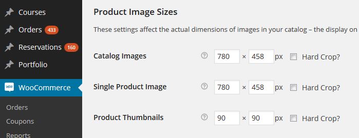
WooCommerce image sizes
Under WooCommerce -> Settings -> Products You will also find "Product Image Sizes" settings. Make sure the Catalog Images and Single Product Image are not set too small. If they are, you'll see blurry images on your products. Here is how the images are set on our demos:
Dummy Content
If you are new to WordPress or have problems creating posts or pages that look like the theme preview you can import dummy posts and pages here that will definitely help to understand how those tasks are done. You have 3 different .xml files, which will set restaurant, pizza place or coffee shop demo.
Important: Please make sure you have set your links to pretty link, so you won't receive any errors, check also menu description below.
Important: If you are having trouble inserting dummy content and are receiving server errors, you will probably need to set your file permissions on folder wp-content/uploads ( if you don't have the folder, create it manually and set the permissions only on this folder ).
If you don't want to set, can't or don't know how to set file permissions, you can download this .zip file and place it into wp-content folder.
Manual instalation ( with WordPress Importer ):
Installing the WordPress Importer:
- Visit Tools → Import in the WordPress dashboard
- Click on the WordPress link in the list of importers
- Click "Install Now"
- Finally click "Activate Plugin & Run Importer"
In our theme files you will find a .xml file (under anps-framework/classes/importer/ select between 3 dummy content files (dummy1.xml for restaurant, dummy2.xml for pizza place and dummy3.xml for coffee shop)). Use that file in the next step where it says: "Choose a WXR (.xml) file to upload, then click Upload file and import." and click on Upload file and import. In the next step you need to assign all the posts/page to a existing user or create a new user. In this step also be sure to have the Download and import file attachments checked, then click on the Submit button and you are done!
Visual Composer
If you do not want to use our Shortcode Manager, then you can install Visual Composer, which allows you to add content using a visual editor - you do not need to write the shortcodes by hand.
If you need more information on our shortcodes, then check our shortcode section.
Visual Composer help page: http://kb.wpbakery.com/index.php?title=Category:Visual_Composer
Blog Page
You can have multiple blog pages on Kataleya template. You can select between next blog template options: 1 column, 3 columns grid, 4 columns grid, 3 columns masonry and 4 columns masonry. You can also select between categories, if you want to show all categories than you don't need to select any.

Adding blog posts
To add a post to your blog go to Posts → Add New, then add post heading, post content, add Featured image and assign the desired categories. See more details on adding posts.
Adding a video to your Blog posts
Above the Featured image option (right side) on posts you can find the Featured Video option. You can add either the [youtube] or [vimeo] shortcodes to display the videos.
Adding a gallery of images to Blog posts
Above the Featured image option (right side) on posts you can find the Gallery Images option.
Adding Portfolio Posts
Adding Portfolio posts is the same as adding Blog posts, the only difference is that you do not add the posts under Posts, but under Porfolio sections.
Sliders
Layer Slider
The official documentation can be found here.
This site contains many tutorials (FAQ) on this plugin: http://support.kreaturamedia.com/faq/
Slider dummy content
Download it here.
Revolution Slider
The official documentation can be found here.
Download it here.
Widgets
You can add widget in Appearance → Widgets by drag and dropping in the Sidebar box.
Once you have added a widget to the Sidebar box the widget will open and extra fields will appear.
More information on widgets.
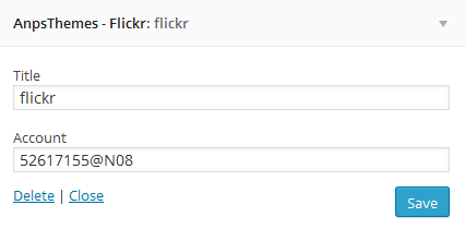
AnpsThemes - Flickr
Enter Flickr account id.
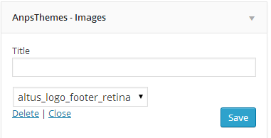
AnpsThemes - Images
You can select any image from media library and shows it in any sidebar.
AnpsThemes - Recent comments
Enter number of comments to show. Recent comments widget shows latest comments text, post title and date.
AnpsThemes - Recent posts
Enter number of posts to show. Recent posts widget shows latest posts text, post user image, post title and date.
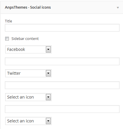
AnpsThemes - Social icons
You can add up to 12 social icons into different sidebars. If you will select Sidebar content checkbox, icons will be bigger like in blog sidebar.
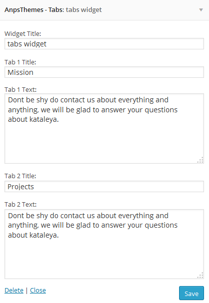
AnpsThemes - Tabs
You are able to have 2 tabs, so you can enter title 1, content 1 for tab 1 and title 2, content 2 for tab 2.
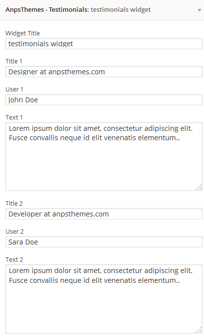
AnpsThemes - Testimonials
You are able to have 3 testimonial items.
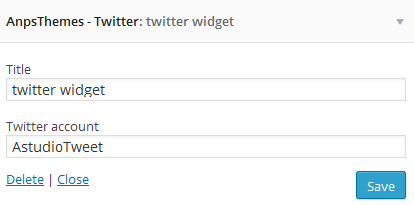
AnpsThemes - Twitter
Enter Twitter account id.
Shortcodes
Accordion
[accordion opened="false" type=""]CONTENT[/accordion]Name Default value Description content * / [accordion_item] shortcode goes here. type / You can select type="toggle" to have toggle instead of accordion. opened false First item in accordion can be opened or closed. You need to set opened to true. Accordion item
[accordion_item title=""]CONTENT[/accordion_item]Name Default value Description content * / Text for accordion item content. title / Accordion item title. Alert
[alert type="warning"]Lorem ipsum dolor sit amet, consectetur adipisicing elit. Natus, nihil?[/alert]Name Default value Description content * / Text that will be shown in the alert message. type normal Changes the alert message color and icon. Options: "", warning, info, success, useful, normal Button
[button link="#" target="_self" size="large" style_button="style-1"]LARGE BUTTON[/button]Name Default value Description content * / Text that appears inside the button link / Can contain either an URL (i.e. http://www.anpsthemes.com) or an anchor link (#contact) target _self This attribute specifies where to display the linked resource. Can be set to _self, _blank, _parent or _top (read more about these values). size small Determines the button size. Can be set to either small, medium of large. style_button style-1 This changes the button styling. Can be set to either style-1, style-2 or style-3. color / Adding this attribute will change the text color. The color needs to be added as a HEX value (ie. #000). background / Adding this attribute will change the background color. The color needs to be added as a HEX value (ie. #000). Color
[mark style="style-1"]Lorem ipsum dolor sit amet, consectetur adipisicing elit. Natus, nihil?[/mark]Name Default value Description content * / Text that will have the specified color. style style-1 Color style. Can be set to either style-1 or style-2. Columns
[vc_column width="1/2"][/vc_column]
[vc_column width="1/2"][/vc_column]
Name Default value Description width / Enter the layout , like: 1/2 + 1/2 or 1/3 + 1/3 + 1/3, etc. Coming soon
[coming_soon image="" date="2015/10/20 19:00"]content (any shortcode)[/coming_soon]Name Default value Description content * / You can add any shortcode or any other content here. image / Background image url. date / Date example: 2015/10/20 19:00 (20th October 2015 at 19:00). Contact form
[contact success_msg="Message sucessfuly sent!" error_text="Please insert only letters" error_number="Please insert numbers only" error_email="Please insert a valid email" error_phone="Please insert a valid phone number" error_required="This element is required" email_from="support@anspthemes.com" subject="This is an awesome email!"]CONTENT[/contact]Name Default value Description content * / [form_item] or/and [contact_button] shortcode. subject This is an awesome email! The message that will appear, once the user has submited the contact form. email_from support@anspthemes.com Email from where the email will be sent. success_msg Message sucessfuly sent! Success message when email will be sent. error_text Please insert only letters Error for text valitaion. error_number Please insert numbers only Error for number validation. error_email Please insert a valid email Error for email validation. error_phone Please insert a valid phone number Error for phone validation error_required This element is required Error for required fields. Email to you can set in Appearance -> Theme options -> General settings -> Social accounts
Contact form Element
[form_item type="text" rows="5" required="false" placeholder="" validation="none"][/form_item]Name Default value Description type text You can select between next types: text, textarea, captcha rows 5 Rows in textarea. required false If you check this field, then the user will have to write some information inside. placeholder / This is the text that is shown inside of the box and disappeares when the user click on the box. It is also used as name and id in checkbox, dropdown, radio option. validation none This is the validation type and you can choose None, Text, Number, Email and Phone Number (For text and textarea type). Contact form Button
[contact_button /]This shortcode adds clear and submit buttons to contact form.
Contact info
[contact_info]
    [contact_info_item icon=""]TEXT[/contact_info_item]
[/contact_info]
Name Default value Description content * / Text icon / Adds a icon inside the button. Can be set to any FontAwesome icon. The icon name needs to be specified without the fa- prefix (ie. codepen and not fa-codepen). Dropcaps
[dropcaps style="style-1"]Lorem ipsum dolor sit amet, consectetur adipisicing elit. Natus, nihil?[/dropcaps]Name Default value Description content * / Text that will have the dropcaps letter. style style-1 Dropcaps style. Can be set to either style-1 or style-2. Error 404
[error_404 title="" title_large="" sub_title=""]Lorem ipsum dolor sit amet, consectetur adipisicing elit. Natus, nihil?[/error_404]Name Default value Description content * / Text. title / Error 404 page title (h1). title large / Error 404 page large title (em). If title exists, title large will be behind title. sub_title / Error 404 page subtitle (h2). Google Maps
As of June 2016, Google Maps no longer support keyless access and requires an API Key to work. Go to https://developers.google.com/maps/documentation/javascript/get-api-key and follow the described steps to retrieve an API key.
Once you receive your API Key, inside the WordPress admin dashboard navigate to Appearance - General Settings - Social accounts and insert your API key in the Google Maps input field.
[google_maps zoom="14" fullwidth=""]121 Kings St Melbourne VIC 3000[/google_maps]Name Default value Description content * / Location to be shown with a pin, ie. "121 Kings St Melbourne VIC 3000". zoom 14 At low zoom levels, a small set of map tiles covers a wide area; at higher zoom levels, the tiles are of higher resolution and cover a smaller area. fullwidth If is set to true than Google maps are full width. Heading
[heading size="2" heading_class="content_heading" h_id="heading_id" icon_type="svg1" icon="" img=""]Lorem ipsum dolor sit amet, consectetur adipisicing elit. Maxime, nostrum.[/heading]Name Default value Description content * / Text type heading Heading type. Can be set to heading, content_heading or style-3. size 2 Heading size. Can contain values from 1 to 5 (larger the value, smaller the heading size). h_id / Adds an ID attribute to the element. Useful for one page menu referencing. icon_type svg1 You can choose between 3 svg icon types, you can also select font awesome icon or custom image. All types: svg1, svg2, svg3, icon, image icon / You need to select icon_type = icon. Can be set to any FontAwesome icon. The icon name needs to be specified without the fa- prefix (ie. codepen and not fa-codepen). img / You need to select icon_type = image. Enter image url. Icon
[icon url="" target="_self" icon="" title="" subtitle=""]Lorem ipsum dolor sit amet, consectetur adipisicing elit. Maxime, nostrum.[/icon]Name Default value Description content * / Text url / Icon, title and subtitle will be clickable. target _self Default value is _self. icon / Can be set to any FontAwesome icon. The icon name needs to be specified without the fa- prefix (ie. codepen and not fa-codepen). title / Icon title (h2). subtitle / Icon subtitle (span). List
[list class=""]CONTENT[/list]Name Default value Description content * / [list_item] shortcode goes here. class / You can add next class attribute: icons, hand, arrow, circle-check and number List item
[list_item icon=""]CONTENT[/list_item]Name Default value Description content * / List item text. icon / If you select icons as class in list shortcode, than you can set different FontAwesome icon for any list item. The icon name needs to be specified without the fa- prefix (ie. codepen and not fa-codepen). Opening time
[opening_time title="we are opened"]CONTENT[/opening_time]Name Default value Description content * / [opening_time_item] shortcode goes here. title we are opened Enter title for opening time shortcode Opening time item
[opening_time_item day="Mon" from="9:00" to="22:00"][/opening_time_item]Name Default value Description day / Enter day in opening time item. Example: Mon from / Enter from in opening time item shortcode. Example: 9:00 to / Enter to in opening time item shortcode. Example: 22:00 Portfolio
[portfolio filter="on" per_page="" orderby="date" order="ASC" category="category-id" /]Name Default value Description per_page / Number of posts to be displayed at once. filter on Filter on/off. Shows category filter. orderby / The way the posts will be ordered. Can be set to date, ID, title, name or author. order default The order in which the posts will be displayed. Can be set to default, ASC or DESC. category / Id of a specific category. Pricing tables
[pricing_table title="" currency="€" price="0" period="" button_text="" button_url="" featured=""]CONTENT[/pricing_table]Name Default value Description Content * / [pricing_table_item] title / Pricing table title. currency € Enter currency. price 0 Price. Period / Time period, example: monthly. button_text / Enter button text. button_url / Enter button url. featured / Pricing table is featured if is set to true. Pricing tables Item
[pricing_table_item]TEXT[/pricing_table_item]Name Default value Description Content * / Text Recent Blog posts
[recent_blog number="3"]Name Default value Description number 3 The number of posts to be displayed. Recent Portfolio posts
[recent_portfolio number="6" category=""]Name Default value Description number 6 The number of posts to be displayed. category / The category (id) from which the posts will be displayed. Row
[vc_row font_color="#666" el_class="extra-class" id="this-awesome-id" has_content="false"][/vc_row]This shortcode is used for wrapping content, so that the child elements are layout correctly.
Name Default value Description content * / Child elements font_color / Adding this attribute will change the text color. The color needs to be added as a HEX value (ie. #000). el_class / If you wish to style particular content element differently, then use this field to add a class name and then refer to it in your css file. id / Adds an ID attribute to the element. Useful for one page menu referencing. has_content true Changes where the .container element is called. Can contain either true (the container is added), false (no container is added) or inside (inside content wrapper). Statement
[statement parallax="false" parallax_overlay="false" image="" color="" container="false" slug=""]CONTENT[/statement]Name Default value Description content * / Content (shortcode or text) parallax false If set to "true", the shortcode will get the parallax effect. parallax_overlay false If set to "true", the shortcode get a dark effect over the shortcode image / Background image. color / Background color. container false Adds div around statement. slug / Unique name for the shortcode Tabs
[vc_tabs type="horizontal" el_class="extra_class"][/vc_tabs]Name Default value Description content * / Tab elements el_class / If you wish to style particular content element differently, then use this field to add a class name and then refer to it in your css file. type horizontal This attribute changes the tabs layout to either horizontal or vertical. Tabs Element
[vc_tab title="Title"]Lorem ipsum dolor sit amet, consectetur adipisicing elit. Maxime, nostrum.[/vc_tab]Name Default value Description content * / Text/Shortcodes title / Tab title that is shown in the tab menu section. Testimonials
[testimonials]
    [testimonial user="" title=""]TEXT[/testimonial]
[/testimonials]
Name Default value Description content * / Testimonial text user / User name/surname/nickname. title / User's title (for example: Designer at anpsthemes.com). Text Block
[vc_column_text]Lorem ipsum dolor sit amet, consectetur adipisicing elit. Consequatur, at.[/vc_column_text]Name Default value Description content * / Text Twitter
[twitter title="Our Twitter Feed" parallax="true" parallax_overlay="true" slug="twitter-slug" image="http://anpsthemes.com/kataleya/wp-content/uploads/2014/07/slider_image21.jpg" color=""]anpsthemes[/twitter]Name Default value Description content * / Twitter username hadle, like anpsthemes (https://twitter.com/anpsthemes) slug / This is used for both for none page navigation and the parallax effect (if you do not have the navigation need you enter a unique slug if you want parallax effect to function). title / Enter twitter element title. parallax false If set to true, the background image will have the parallax effect (http://en.wikipedia.org/wiki/Parallax_scrolling). parallax_overlay false If set to true, it makes the background image darker. image / URL for the background image. color / You can enter background color. For example: #000000 Vimeo
[vimeo]23534361[/vimeo]Name Default value Description content * / Video ID YouTube
[youtube]keDneypw3HY[/youtube]Name Default value Description content * / Video ID Quote
[quote]Lorem ipsum dolor sit amet, consectetur adipisicing elit. Natus, nihil?[/quote]Name Default value Description content * / Text that will displayed inside the quote wrapper. Adding sidebars
Sidebar generator
Before you can start adding widgets you need to create a new sidebar, but you can add widgets to the already added ones, but you can create how many new sidebars you like. You can find the sidebar generator under Appearance → Sidebars.
Adding a sidebar to a page or post
You can add a sidebar to all pages, except the portfolio page and single item portfolio page. You can add a sidebar to a page/post by selecting the desired by going to the desired item in WordPress (under Pages/Posts) and under the content editor you will see a box called Sidebars. You can select eiter only one of the sidebars, either both of them.
Important: Be carefull when adding two sidebars, because some elements aren't designed to be used with two sidebars ( two or more column sidebars ).
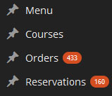
Kataleya restaurant plugin
Restaurant plugin is included in a Kataleya theme and you need to enable it. We divided our plugin to four parts: Menu, Courses, Orders and Reservations.
Menu
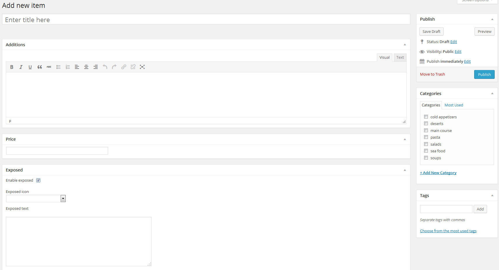
To add new menu item you need to add title, additions, price (without currency) and select category. You can also select if item is exposed and add exposed icon and exposed text. If exposed text exists than it will be visible on menu item hover. You can also add tags to menu item, which will be shown in menu single item shortcode and menu item shortcode.
Settings
- There you enter your currency. Default is $.
- Currency position you can set on left or right. Default value is left.
- Category orderby shortcode will change orderby in [anps_menu] and in order form orderby for categories. You can choose between: id, count, name, slug and none.
- Category order shortcode will change order in [anps_menu] and in order form order for categories. You can choose between: ascending and descending.
Shortcodes
There are 2 shortcodes: Restaurant menu:
[anps_menu type="horizontal/vertical" orderby="date/id/title/name" order="ASC/DESC" /]where you can choose between horizontal or vertical type. You can also set orderby and order for products. Restaurant menu shortcode will take all categories and all items and show it on frontend. Second shortcode is[anps_single_menu category="ID" orderby="date/id/title/name" order="ASC/DESC" /]where you add 1 category and all menu items will be on frontend. You can also set orderby and order for products.Courses
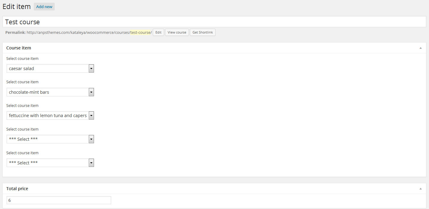
Courses are new functionallty where you can add up to 5 menu items to one course. You can also enter price without currency.
Shortcodes
There is shortcode [anps_single_course course_id='' course_class='' /] where course id is id of course, you can also choose between next course_classes: align-center, align-left and align-right.
Orders
Customers can order from menu on frontend and you get all orders into wordpress admin area. Where you have to approve it or unapprove it. Everytime when you approve/unapprove order customer gets e-mail. You can also add order from wordpress admin area manually.
Settings
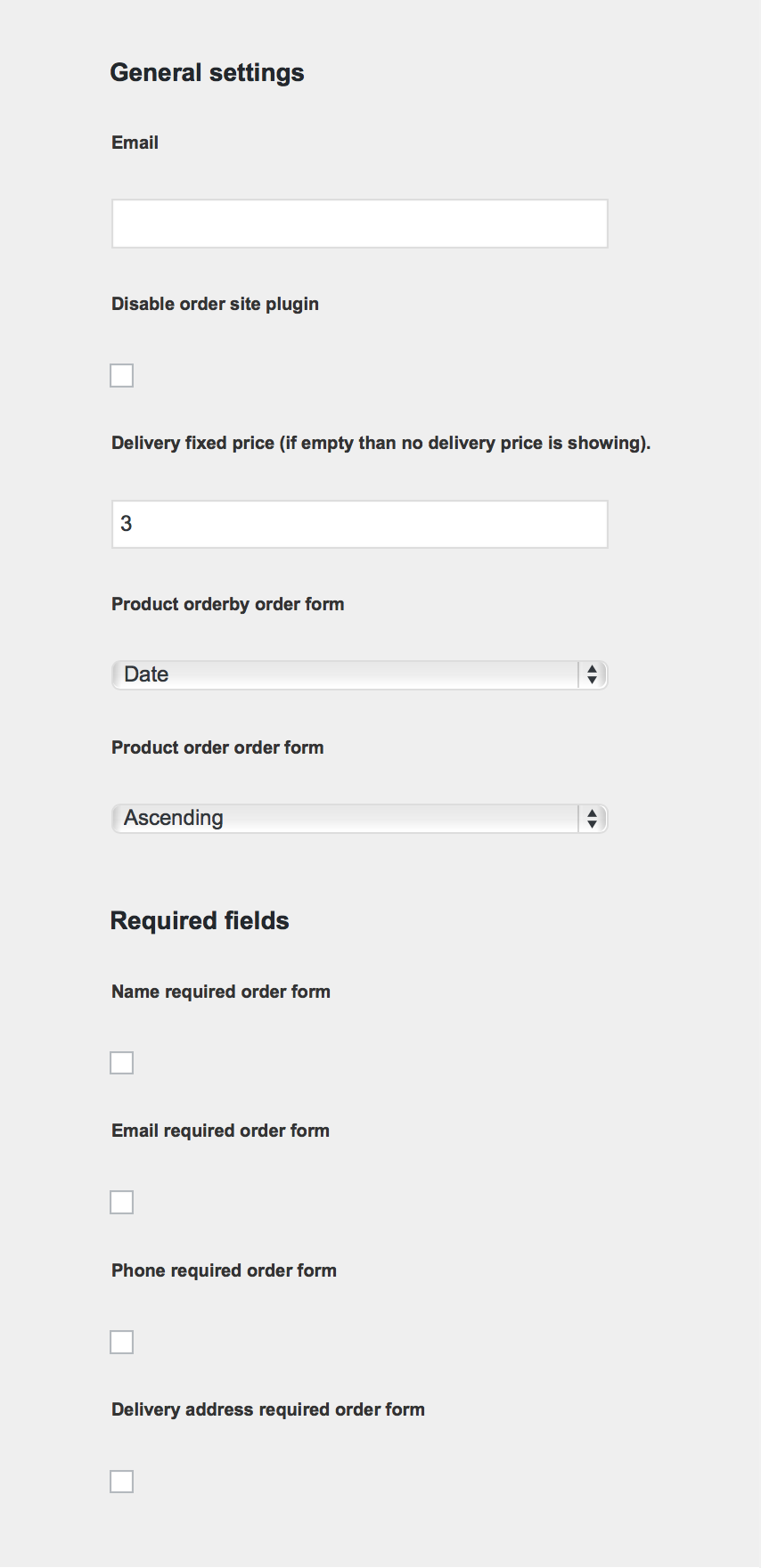
Under general settings you can set email where all orders will be sent and you can disable order form on site. If delivery fixed price is empty than nothing will change on your site otherwise delivery price will be add to total order price.You can also set orderby and order for Products in order form. Under required fields you can also set which input field will be required in order form. You can choose name, email, phone and/or delivery address.
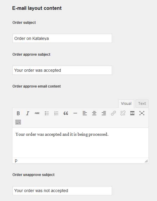
In E-mail layout content you can set order subject, order approve subject, order approve email content, order unapprove subject and order unapprove email content.
Shortcodes
You can add order form on your site with next shortcode:
[anps_order /]and it will add form with name, email, phone, delivery address and button.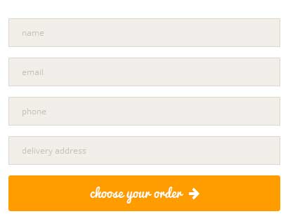
Selecting from menu and than make an order adds automatically if you have at least 1 menu item and you didn't disable order form. When customer adds order you get an e-mail and in wordpress administration you see new order.
Reservations
Customers can make a reservation on frontend and you will get all reservations into wordpress admin area. Where you have to approve it or unapprove it. Everytime when you approve/unapprove reservation customer gets an e-mail. You can also add reservation from wordpress admin area manually.
Settings
Under general settings you can set email where all orders will be sent and you can disable order form on site.
In E-mail layout content you can set reservation subject, reservation approve subject, reservation approve email content, reservation unapprove subject and reservation unapprove email content.
Shortcodes
To add reservation form on your site, you need to insert next shortcode:
[anps_reservation style="" success_msg="You have successfully made a reservation!"][anps_reservation_item type="" width="" placeholder="" date="2014-1-22 21:00"/][/anps_reservation]Style could be empty (default) or box (it adds boxed line around form). In anps_reservation shortcode you can set type ("text" for name, "number" for how many, "email" for e-mail, "phone" for phone and "message" for message), width (3/3, 2/3, 1/3), placeholder (any text you want), date (should be in next format: 2014-1-22 21:00). Name, email and phone are required fields.Translating the Theme
Our theme comes localisation ready out of the box – all that’s needed is your translation.
There are several methods to create a translation, most of which are outlined in the codex (http://codex.wordpress.org/Translating_WordPress), however, we find the easiest method is to use a plugin called codestyling localisation.
Updating the Theme
Before you update:
Go to our ThemeForest item page and see all of the changes in the change log. Here you will also find if there are any problems if you update / what you have to do.
Save all of your changes files, ie. the custom.css file (you don't need to worry if you are using a child theme).How to update
To update our theme, go to ThemeForest and download the newest version of our theme (you can check all of your purchased items under the Downloads tab). Unzip the .zip files until you get the themes (altus) folder, then go to your server and place the files under wp-content/themes/.
Please note: our theme cannot be updated via WordPress, so if you are promted to update the theme, please do not click on the update, as you may lose your files.
Child Theme
A WordPress child theme is a theme that inherits the functionality of another theme, called the parent theme, and allows you to modify, or add to, the functionality of that parent theme. The whole idea of a child theme is that you can modify, and add to the functionality of that parent theme without modifying it directly. The parent remains intact, everything is built within the child theme.
Reasons to use child theme:
- Easy updates - If you’re using a child theme, you don’t have to worry about any updates. Whenever you update the theme, only the parent theme will be updated. Your child theme, and everything you’ve coded in it, remains intact.
- Changes - If you’re using a child theme, every modification can be found in the child theme’s folder and thus you can track all the changes you made very easily. To start using our child theme, then just activate the
Footer
You can set footer columns or disable footer in every page/post or set it global in theme options.

You can set up the footer in the same part as Widgets, Appearance → Widgets. The only difference is you don't drag and drop in the sidebar boxes, but you add them in Footer Widget Areas. In each column you can add what you like, as the widgets look different in the footer than in the sidebars.
Bootstrap
This theme has been built using Twitter Bootstrap. We did not use every aspect of it, but only include parts of it. For example, we have removed the default Glyphicons font icons and include Font Awesome instead.
If you want to use a feature of Bootstrap that we did not include, then go to assets/sass/bootstrap.scss and uncomment the import functions.
Many elements used in this theme are almost identical to Bootstrap components, so you check their documentation if you need extra help or check if they have extra functionality that is outside the scope of our theme.
Sass
Our theme has been build using Sass(Syntactically Awesome Style Sheets) and the sass version of Bootstrap. This means you can quite easily add your own markup and change the theme to fit your project.
Sources and Credits