Importance of communicating your product or service is often forgotten in your content. Time is precious and these days people are mostly glancing through web pages to get that crucial piece of information that is relevant to them, in this world icons are the way to go.
Icons are a perfect tool for grabbing attention out of the clutter of dry text. Either in short descriptive sections, menus or using them standalone, it will pop up during scanning of the content and make users stop on the spot you need them to.
In this article, we will give you some tips on how to use them to maximize your efficiency.
Choosing your Icons
First, you have to select your icons to match to content they want to represent. Either being for Construction, Hairdresser or any other niche in which you work.
The next choice you have to make is the type: font icons or images. Note that it’s a bit harder to find free ones for a specific niche, so you will most likely need to use images. If you do find font icons, make sure to optimize the file using tools like optimization tools. This way you only load the ones you need.
Standard image formats like .jpg, .png and .gif are not the recommended, as you will need to upload a 2x image size to make them crisp on higher pixel density screens. SVG is the way to go, as they will look great on all mobile and desktop devices. In most cases, when downloading an icon pack, you will have a vector PDF, EPS or Ai versions available, so you will be able to generate the SVGs.
How to use your icons
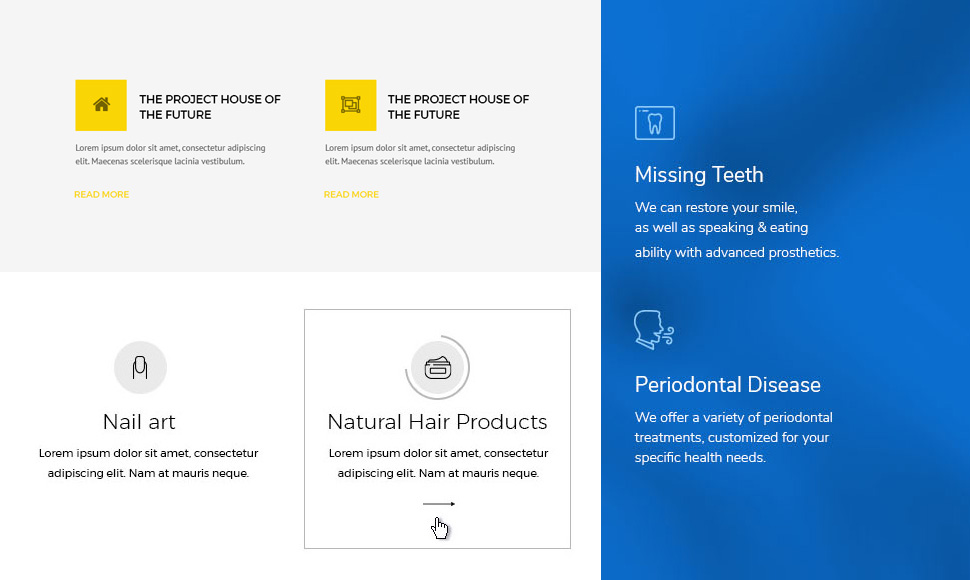
The priority should be to deliver information faster to your reader. Combining them with text is a great way for users to first quickly find what they are looking for (icon) while also having additional information about (text). Example: users want to know what services your offer. They scan through the site and spot the them. They can quickly have a broader view of your services using the icons. Then they can immediately read more information about a specific service if they so require. Few examples:
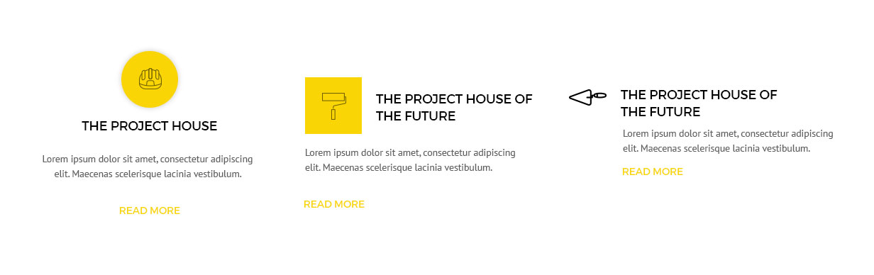
3 different examples of icons placements
Presenting your new features
Icons are great for presenting new features. In some cases image would be more appropriate and are more descriptive but its so hard to find a great image, especially using stock which is in most cases not natural looking. With icons, there is no such feeling and they take up less space and are usually easier on the load.
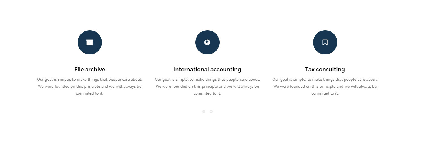
In this example services are presented in a carousel with icons
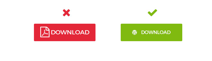
Use icons to draw attention on your CTA
I am sure you already know about the importance of CTA (Call To Actions). Spicing it up with icons is a simple way to go as well besides the text what can you cramp up there?

4 different content types to download presented with icons
When placing them into buttons, be sure to watch it on the paddings, spacings, and size, as this is crucial for a good presentation and readability.
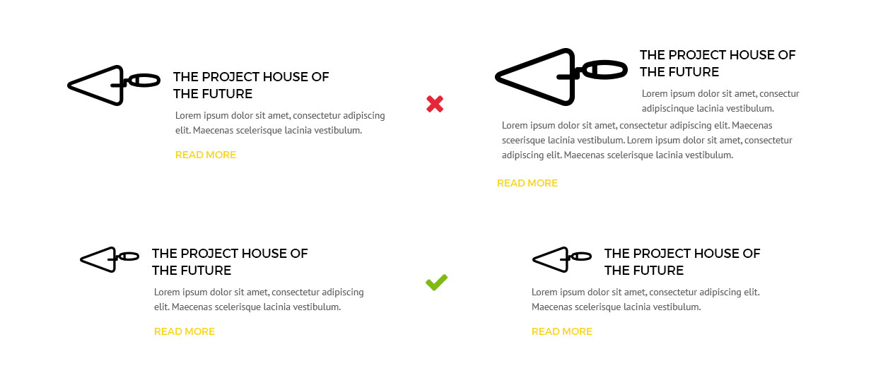
How to use icons in your elements properly
One example which I run into constantly is that users tend to make icons much larger than the text itself, which I would not recommend.
Also avoid breaking the lines, which usually happen because of the icons being too big in relation to the title.
Consistent style of icons
Icons should be consistent in their style across the page. There is nothing worst than many different styles which break the branding of your website.
That is why it is great to choose the ones that offer a complete package for your service in the same style.
Free, premium or custom made
There are quite a few options out there. It all depends on your needs. Sometimes the business is too specific to find the ones that would represent the purpose well enough, so the best way would be commissioning a custom design. However, you have quite a few free options.
Some free icon packs or icon repositories: